Monday, February 26, 2007

Usability Presentation Feedback

Nice presentation, Chris. Well done.

Feedback during the presentation:
  • The ribbon doesn't look like a live usable feature. Visual changes (3D, drawing it as a button, showing arrows, etc.) and making a more intuitive hard-coded status message will help. "Clustering" is not a verb our participants understand.
  • The missing functionality has impacted our tasks. We need to get things built.
  • When demoing to the participants, we should demo the ribbon.
Friday, February 16, 2007

Code Jam/Meeting Monday

Attention, Team Cluster!

Check your Google Calendars and you will see a LOVELY event scheduled for Monday. We have a lot of ish to do and we will be doing it - starting bright and early at 9am in 002. We'll be putting our heads together to prioritize the rest of the implementation and beholding the gloriousness of Fred's sexy framework. Come with your codin' fingers on.

Don't be too sad - if it weren't for a bunch of dead Presidents you'd be in class anyway.

Monday, February 12, 2007

SVN + VisualStudio Integration

Peter told me about a cool SVN program that integrates with Visual Studio so that you don't have to mess with Tortoise. It's pretty good, although the setup is kinda weak.

You can download it here:
http://ankhsvn.tigris.org/files/documents/764/36344/AnkhSetup-1.0.1.2736-Final.msi

And, it tells you how to checkout a project here:
http://ankhsvn.com/AnkhWiki/Getting+Started.ashx

But, before you can actually check out a project, you need to do do this so you can do svn+ssh:
http://ankhsvn.com/AnkhWiki/Frequently+Asked+Questions.ashx#Imtryingusesvn+sshbutigetanerrordialogwhenItrytocheckoutorupdate

Thursday, February 8, 2007

re-design notes

I was looking at the 'Revised Prototype' from Project 1 on the course page. I wanted to bring attention the 'Events' section of the prototype.

Right now the calendar screen shows the events in a standard list. The viewer navigates through the days of the calendar with the left and right arrows. The idea of scrolling through the days and not seeing events organized on a hour-by-hour basis throws me. I think that our next revision should either (1)leverage the DayPlanner metaphor a little more heavily, and space the events out on a scale, starting at 7am and ending at midnight or (2)go with the standard list but revise the navigation to a less formal 'earlier, later' scheme.

Tuesday, February 6, 2007

State of things...

I had some really slick stuff in mind for the Cluster UI, but the thing is, none of it can be done within the Visual Studio Forms Designer. The forms designer, especially the one for mobile UI's, is very inflexible and gives you only a small number of boring looking widgets to play with. Nobody makes fancy UI's with this thing.

So, I'm working on some custom UI classes/controls that do what I want. The problem is I'm going to be really really busy until Wednesday afternoon, so I don't expect to have anything to show until late Thursday.

Monday, February 5, 2007

Source Respository

I set up an SVN respository, that has almost absolutely nothing useful in it yet.

You'll need to download Tortoise SVN to access it.

To check things out, you would:

- Right click somewhere in explorer and do "SVN Checkout".
- Use this for the URL: svn+ssh://your_username_here@attu.cs.washington.edu/projects/instr/cse490f/wi07/a/svn
- That should be it.

To do anything, you'll need VS 2005 and the SDK for Windows Mobile 5.0 Smartphone. You can download the SDK from here:
http://www.microsoft.com/downloads/details.aspx?FamilyID=dc6c00cb-738a-4b97-8910-5cd29ab5f8d9&DisplayLang=en

You probably can't use the lab machines for development, as they won't have the SDK installed and we probably don't have the permissions to install it. :-(

I guess you can get VS2005 from that MSDN thing we get through the CSE dept.

Saturday, February 3, 2007

Calling All Design Changes

We have nine days to get our first code-based prototype done - which means we need to decide on our design changes for this iteration now in order to ensure that the coding process goes smoothly. If you've got strong feelings about design changes, get them up here as soon as possible so that we can get these decisions made.

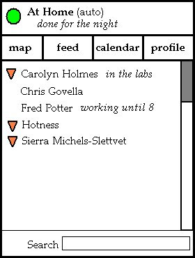
I'll start. Here's an idea I have about the home screen, though I'm not really that satisfied with it. But I'll throw it out there so you guys can let me know what you do or don't like about it while I think about alternatives. You can disregard the font and colors and all that. I was going for layout not aesthetics.


  • Location info moved to the top - because that's where it should be. The user can check it when they first enter the app (and adjust it if they need to) but as they won't be spending the majority of their time fiddling with their location settings, it's tucked out of the way so they can focus on other things. Also, the status message that the user has (in this case it's "done for the night") appears here as well.
  • There are buttons to get to other key areas of the app. This allows for a quick jump to the map view (centered on the user), the feed (unless we decide to take it out of the design), and the calendar (I really don't think it's necessary to include the abstract view of upcoming appointments on the home screen), and the functionality that let's the user adjust their own profile (an area of the app we need but we have not yet focused on). I'd like the buttons to be icons instead of words. This part I don't love - so I'd love to hear your thoughts on ordering, icons, and what should or shouldn't make the list here.
  • The contact list - this is the "new" entry point for all the social networking stuff. An icon tells you if the user is listed on the map (e.g. is broadcasting a location), and you also get their status message if they've set one. Highlighting and selecting a user will bring up their social networking page - which should contain a quick button to jump to the map. I'm not sure if that is more expected than going straight to the map from the list on the home screen - I'd love to know what you guys think.
  • Overall...the whole damn thing looks like something Microsoft would make. Needless to say, that's not a good thing.

Friday, February 2, 2007

Kevin and Andy on Cluster

As part of the Video Prototyping Project, Kevin and Andy weighed in on some design changes for Cluster. The following is the except from their paper:

We introduced a new UI widget to CLUSTER called Friend Radar. This view shows your friends and their locations visually. Although CLUSTER already has a map view, were you can see the locations of your friends, we felt that it actually provided too much information in some cases. Especially since CLUSTER is meant to be on mobile devices with small screens, we felt that the existing Google Maps-like interface would be overkill if you just wanted to see where your friends were at a glance.

Our Friend Radar provides a much more abstracted view. The relative positions of friends does not directly correspond to their locations. Instead, friends appear as dots grouped around their current location. Readers familiar with Digg Swarm will see the analog between "friends" and "diggers", and "locations" and "stories". Much like how the Digg Swarm visualization shows diggers jump from story to story as they vote on each one, Friend Radar will show your friends jump from location to location as they move about in the real world.

We believe the Friend Radar view has several advantages over the map view. Since the locations that your friends broadcast are already discrete (i.e. they don't tell you exact longitude, latitude coordinates) for privacy reasons, it doesn't make sense to plot their locations on a map because you don't really know their exact locations anyway. Our view makes it easy to see what the popular locations are at a glance, since it's easier to pick out the locations with the most dots around them rather than to scroll around on a map, searching for your friends. Also, our view handles multistory building better. For example, the Friend Radar would should one group of friends clustered around the Atrium and another group around the Labs, but if you used the map view you might think they were all in the same place since one location is on top of the other.

The main disadvantage of Friend Radar is that it does not provide as much information as the map view. It does not show roads or buildings and the distance between two friends on the screen is not related to their real distance. However, this is only a disadvantage if the user needs such information. For example, if you already are familiar with where the favorite locations of your friends are, then you might ignore this extra information, and may even find it distracting.