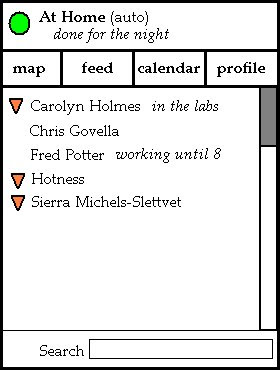
I'll start. Here's an idea I have about the home screen, though I'm not really that satisfied with it. But I'll throw it out there so you guys can let me know what you do or don't like about it while I think about alternatives. You can disregard the font and colors and all that. I was going for layout not aesthetics.

- Location info moved to the top - because that's where it should be. The user can check it when they first enter the app (and adjust it if they need to) but as they won't be spending the majority of their time fiddling with their location settings, it's tucked out of the way so they can focus on other things. Also, the status message that the user has (in this case it's "done for the night") appears here as well.
- There are buttons to get to other key areas of the app. This allows for a quick jump to the map view (centered on the user), the feed (unless we decide to take it out of the design), and the calendar (I really don't think it's necessary to include the abstract view of upcoming appointments on the home screen), and the functionality that let's the user adjust their own profile (an area of the app we need but we have not yet focused on). I'd like the buttons to be icons instead of words. This part I don't love - so I'd love to hear your thoughts on ordering, icons, and what should or shouldn't make the list here.
- The contact list - this is the "new" entry point for all the social networking stuff. An icon tells you if the user is listed on the map (e.g. is broadcasting a location), and you also get their status message if they've set one. Highlighting and selecting a user will bring up their social networking page - which should contain a quick button to jump to the map. I'm not sure if that is more expected than going straight to the map from the list on the home screen - I'd love to know what you guys think.
- Overall...the whole damn thing looks like something Microsoft would make. Needless to say, that's not a good thing.
2 comments:
So, we haven't really talked about this yet. I was wondering how/if we were going to allow the user to set a status message. It would basically just go straight to their facebook status.
Any thoughts?
UPDATE: We're going to scrap the search box. I just meant it to search through the contacts list as this is how my phone does it. But Fred's much cooler phone does something better - it highlights the letters in the results itself instead of recording them in a separate place.
Besides, search boxes are confusing. We've had trouble communicating scope to our users in previous iterations.
Post a Comment