Thursday, March 1, 2007

Thoughts On CampusMesh

Landay pointed me at CampusMesh, a project out of the New Jersey Institute of Technology.

It's a Cluster-esque app that's a part of a group of mobile social applications called SmartCampus that they're developing with the following stuff in mind (from their website):
  1. Community building / social network impacts
  2. Team / group coordination
  3. User privacy [personal exchanges & location data use]
  4. User Interface Techniques
  5. Middleware design
  6. Security [user authentication, access control, intrusion prevention, data integrity, etc]
There really isn't much actual description about the app available on their website and I wasn't able to find any screen shots, but CampusMesh itself is described as "a location-aware geo-temporal social matching, reminding and coordination system." They've really focused on their app being a tool - it provides reminders and fuels goal-based group interaction whereas we've kept Cluster broad to enable an open-ended and casual social-networking experience. Our adhesion to the facebook model has made Cluster a hobbyists' toy and kept it out of the "getting stuff done" space.

It's not that Cluster couldn't be used to facilitate work (by which I mean things you do for your job or for school). There have been dozens of times I've tried to coordinate project meetings with Sierra on the fly and we've both noted that a working Cluster could have smoothed the process. But it's more that we have been designing for our own demographic - college age people who use social-networking purely for extra-curricular enjoyment. Facebook and myspace might bleed into your "work life" but only in the areas where your private "friend life" does, such as going out for drinks with your coworkers after work on friday or blogging about work stuff.

To oversimplify, CampusMesh seems akin to running Outlook or Excel on your phone - so that you can bring your work with you and use your social network to enhance your productivity on the go. Having Cluster on your phone is supposed to be much more like having chat, facebook, and your social calendar so that you needn't leave your connection with your holistic social network at your PC when you can't be with your friends physically.

It would be interesting to spend some time thinking about what kind of tasks people will want out of their always available location-aware social network that never leaves their side. How does the tool help them conduct their broader life - not just a segment of it like work (CampushMesh) or play (Cluster). The telephone itself is an example of tool that serves a broad communication purpose but serves a specialized role in different areas (mobile, land, work phones, personal numbers, household) while the higher level concept remains the same (you dial someone's phone up, it rings, they answer, you talk...) . Cluster could still be a similar sort of tool since we really haven't committed to a specialization yet. However, we haven't been designing for the open-ended possibilities either. If there was more time, I've love to devote some effort here once all the baseline functionality we've already laid out is in place.

Okay. Apologies for the novel.

The SmartCampus Project Site

Monday, February 26, 2007

Usability Presentation Feedback

Nice presentation, Chris. Well done.

Feedback during the presentation:
  • The ribbon doesn't look like a live usable feature. Visual changes (3D, drawing it as a button, showing arrows, etc.) and making a more intuitive hard-coded status message will help. "Clustering" is not a verb our participants understand.
  • The missing functionality has impacted our tasks. We need to get things built.
  • When demoing to the participants, we should demo the ribbon.

Friday, February 16, 2007

Code Jam/Meeting Monday

Attention, Team Cluster!

Check your Google Calendars and you will see a LOVELY event scheduled for Monday. We have a lot of ish to do and we will be doing it - starting bright and early at 9am in 002. We'll be putting our heads together to prioritize the rest of the implementation and beholding the gloriousness of Fred's sexy framework. Come with your codin' fingers on.

Don't be too sad - if it weren't for a bunch of dead Presidents you'd be in class anyway.

Monday, February 12, 2007

SVN + VisualStudio Integration

Peter told me about a cool SVN program that integrates with Visual Studio so that you don't have to mess with Tortoise. It's pretty good, although the setup is kinda weak.

You can download it here:
http://ankhsvn.tigris.org/files/documents/764/36344/AnkhSetup-1.0.1.2736-Final.msi

And, it tells you how to checkout a project here:
http://ankhsvn.com/AnkhWiki/Getting+Started.ashx

But, before you can actually check out a project, you need to do do this so you can do svn+ssh:
http://ankhsvn.com/AnkhWiki/Frequently+Asked+Questions.ashx#Imtryingusesvn+sshbutigetanerrordialogwhenItrytocheckoutorupdate

Thursday, February 8, 2007

re-design notes

I was looking at the 'Revised Prototype' from Project 1 on the course page. I wanted to bring attention the 'Events' section of the prototype.

Right now the calendar screen shows the events in a standard list. The viewer navigates through the days of the calendar with the left and right arrows. The idea of scrolling through the days and not seeing events organized on a hour-by-hour basis throws me. I think that our next revision should either (1)leverage the DayPlanner metaphor a little more heavily, and space the events out on a scale, starting at 7am and ending at midnight or (2)go with the standard list but revise the navigation to a less formal 'earlier, later' scheme.

Tuesday, February 6, 2007

State of things...

I had some really slick stuff in mind for the Cluster UI, but the thing is, none of it can be done within the Visual Studio Forms Designer. The forms designer, especially the one for mobile UI's, is very inflexible and gives you only a small number of boring looking widgets to play with. Nobody makes fancy UI's with this thing.

So, I'm working on some custom UI classes/controls that do what I want. The problem is I'm going to be really really busy until Wednesday afternoon, so I don't expect to have anything to show until late Thursday.

Monday, February 5, 2007

Source Respository

I set up an SVN respository, that has almost absolutely nothing useful in it yet.

You'll need to download Tortoise SVN to access it.

To check things out, you would:

- Right click somewhere in explorer and do "SVN Checkout".
- Use this for the URL: svn+ssh://your_username_here@attu.cs.washington.edu/projects/instr/cse490f/wi07/a/svn
- That should be it.

To do anything, you'll need VS 2005 and the SDK for Windows Mobile 5.0 Smartphone. You can download the SDK from here:
http://www.microsoft.com/downloads/details.aspx?FamilyID=dc6c00cb-738a-4b97-8910-5cd29ab5f8d9&DisplayLang=en

You probably can't use the lab machines for development, as they won't have the SDK installed and we probably don't have the permissions to install it. :-(

I guess you can get VS2005 from that MSDN thing we get through the CSE dept.

Saturday, February 3, 2007

Calling All Design Changes

We have nine days to get our first code-based prototype done - which means we need to decide on our design changes for this iteration now in order to ensure that the coding process goes smoothly. If you've got strong feelings about design changes, get them up here as soon as possible so that we can get these decisions made.

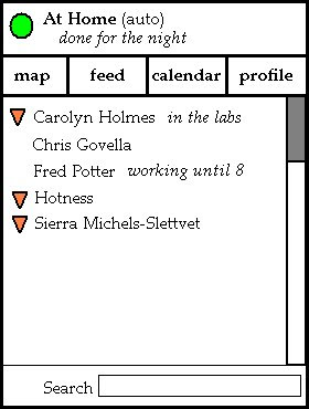
I'll start. Here's an idea I have about the home screen, though I'm not really that satisfied with it. But I'll throw it out there so you guys can let me know what you do or don't like about it while I think about alternatives. You can disregard the font and colors and all that. I was going for layout not aesthetics.


  • Location info moved to the top - because that's where it should be. The user can check it when they first enter the app (and adjust it if they need to) but as they won't be spending the majority of their time fiddling with their location settings, it's tucked out of the way so they can focus on other things. Also, the status message that the user has (in this case it's "done for the night") appears here as well.
  • There are buttons to get to other key areas of the app. This allows for a quick jump to the map view (centered on the user), the feed (unless we decide to take it out of the design), and the calendar (I really don't think it's necessary to include the abstract view of upcoming appointments on the home screen), and the functionality that let's the user adjust their own profile (an area of the app we need but we have not yet focused on). I'd like the buttons to be icons instead of words. This part I don't love - so I'd love to hear your thoughts on ordering, icons, and what should or shouldn't make the list here.
  • The contact list - this is the "new" entry point for all the social networking stuff. An icon tells you if the user is listed on the map (e.g. is broadcasting a location), and you also get their status message if they've set one. Highlighting and selecting a user will bring up their social networking page - which should contain a quick button to jump to the map. I'm not sure if that is more expected than going straight to the map from the list on the home screen - I'd love to know what you guys think.
  • Overall...the whole damn thing looks like something Microsoft would make. Needless to say, that's not a good thing.

Friday, February 2, 2007

Kevin and Andy on Cluster

As part of the Video Prototyping Project, Kevin and Andy weighed in on some design changes for Cluster. The following is the except from their paper:

We introduced a new UI widget to CLUSTER called Friend Radar. This view shows your friends and their locations visually. Although CLUSTER already has a map view, were you can see the locations of your friends, we felt that it actually provided too much information in some cases. Especially since CLUSTER is meant to be on mobile devices with small screens, we felt that the existing Google Maps-like interface would be overkill if you just wanted to see where your friends were at a glance.

Our Friend Radar provides a much more abstracted view. The relative positions of friends does not directly correspond to their locations. Instead, friends appear as dots grouped around their current location. Readers familiar with Digg Swarm will see the analog between "friends" and "diggers", and "locations" and "stories". Much like how the Digg Swarm visualization shows diggers jump from story to story as they vote on each one, Friend Radar will show your friends jump from location to location as they move about in the real world.

We believe the Friend Radar view has several advantages over the map view. Since the locations that your friends broadcast are already discrete (i.e. they don't tell you exact longitude, latitude coordinates) for privacy reasons, it doesn't make sense to plot their locations on a map because you don't really know their exact locations anyway. Our view makes it easy to see what the popular locations are at a glance, since it's easier to pick out the locations with the most dots around them rather than to scroll around on a map, searching for your friends. Also, our view handles multistory building better. For example, the Friend Radar would should one group of friends clustered around the Atrium and another group around the Labs, but if you used the map view you might think they were all in the same place since one location is on top of the other.

The main disadvantage of Friend Radar is that it does not provide as much information as the map view. It does not show roads or buildings and the distance between two friends on the screen is not related to their real distance. However, this is only a disadvantage if the user needs such information. For example, if you already are familiar with where the favorite locations of your friends are, then you might ignore this extra information, and may even find it distracting.

Wednesday, January 31, 2007

Assignment 2

Assignment 2 is one for the history books.

The writeup (.doc), raw survey results (.xls), and Sierra's rockin' PowerPoint presentation are all linked off the docs section of the project web.

Moving forward, I hope everyone is thinking about design changes and solutions to the problems raised in this iteration. And good luck with those video prototypes ;)

Monday, January 29, 2007

Design Progress

From the results of the online survey, I think it's pretty easy to identify where we still have work to do and where we've made progress.

Location: I think we have the three states right and we've done a nice job of trimming the feedback to the user so that it is manageable enough to show on the home screen. The user is still confused as to what subset of their friends are able to see the information they broadcast so we need to find a better way of relating that information - probably also on the home screen. We should think about incorporating Fred's profiles and another indicator on the homescreen for the next iteration.

Calendar/Events: this stuff seems to be most of the way there, though we need to go through and rethink the wording. This will be very important to do before we build a real working prototype.

Social Networking/Map: This area needs a lot of work. We've taken a few different approaches to this and none of them have really shown a lot of promise yet. The map view is important to get right, but I feel strongly that it should not be the main view for this chunk of functionality. People are used to finding their friends through scrolling (or jumping, or searching) through a list. Though it might not be sexy, I think we should think more about trying this simple and classic approach. This needs to be usable before it can get fancy.

Friday, January 26, 2007

Managing Visibility

I'd like to float an idea about how we might change how the user manages visibility. As things stand right now, if the user is broadcasting their location at all, they're able to choose from a list of groups to whom their location will be visible. I'm not sure groups are the right way to manage things - it would seem that the set of people that I want to broadcast location updates to is so small that the task of grouping them is pointless. It's true the cluster is not meant to be some small close knit social network as loopt is - it's an aggregator for all of your social networking. I have over 700 facebook friends and even though I only know 0.5% of them, cluster allows me to interface with all of them. However, as far as location sharing goes, the set of people that I want to give my location to will always be small (I would guess around 15 or so people). So, if N is as little as 15 (or even 20), is grouping more of a pain than it's worth?

Grouping does have its benefits, though. The user could very quickly check "Friends" or "Family" from the list and instantly change their visibility status for several people all at once. What I'm proposing has this same property, but allows the user a little bit more flexibility at the same time. I'm proposing "Visibility Profiles". A profile is just a list of every one of your contacts, with a "Yes" marked for each one that can see your location, and a "No" marked for all those that can't. The user can make a profile, and then save it with a label. For example, I might make a profile called "Out drinking...", which basically shows everyone I know personally where I'm at, but perhaps hides my location from my boss or maybe my parents. Maybe I'm out getting coffee with an ex-girlfriend and I don't want my girlfriend to know: I could make a profile that includes everyone but her.

Here's a rough mock up of what I'm talking about. First, on the main screen it would involve adding a section that shows your visibility:


The user could then action on that section, and would go to another screen that might look something like this:


Here, the user could choose from any their pre-existing profiles. (Note: Change the "Recent Profiles" text to just read "Profiles" - it would list them all). Or, they could choose to make a custom "On-the-go" profile. If they create a custom profile, they could choose to inherit the setup from any of their existing profiles. Or, they could use "Select All" or "Select None" followed by a few individual people selections to quickly build profiles where all but a few people could see their location, or just a few people could see their location.

In the above example, I've created a custom / "On-the-go" profile and I want everyone but Carolyn's Mom and my Dad to know where I'm at. I could then save that profile under any label I wish and use it again later.

The profiles idea is also meant to take into account that, when deciding whether to disclose location to someone, you're influenced by a combination of, one, your relationship to the person, and two, the activity you're currently engaged in. If users had this feature, I would expect to see a lot of profile labels correspond directly to activities or some grouping of activities.

Updated Survey page

https://catalysttools.washington.edu/survey/cgovella/32049

I've added four questions to gather some data on the survey demographics- I'm not sure if everyone got a chance to look at it the first time around -- please take a look and see what should be changed/submit miscellaneous feedback. Also I need to add some thing about privacy/disclosure.

Tuesday, January 23, 2007

Survey Created and Online

Folks,

The survey is up- I want to make sure that the rest of the group thinks it looks kosher before I send out the invites.


https://catalysttools.washington.edu/survey/cgovella/32049

Usability Survey For Assignment 2

The tasks for the online usability study are:

Easy: Find out if your friend Sierra is nearby.
Medium: Hide your location from your Mom.
Hard: Invite your family and friends out for dinner tonight.

The easy task should be followed by these questions:
1) Did you find out how far Sierra is away from you? (yes/no)
2) How far away is she? (fill in the blank)
3) How hard was it to accomplish this task? (easy, medium, hard)
4) Is there anything you liked or didn't like about finding out if a friend is near by? (comment box)

The medium task should be followed by these questions:
1) What color is the indicator dot at the bottom of the home screen (green, yellow, red)
2) Who do you think can see your location right now (no one, some of my contacts, all of my contacts)
3) How hard was it to accomplish this task? (easy, medium, hard)
4) Is there anything you liked or didn't like about hiding from someone? (comment box)

The medium task should be followed by these questions:
1) After you accomplished this task - what position in your upcoming events did the dinner show up in? (1,2,3,4,5)
2) Rate the amount of time it took you to accomplish this task (just right, a little too long, a lot too long)
3) How hard was it to accomplish this task? (easy, medium, hard)
4) Is there anything you liked or didn't like about event invites?

At the end there should also be an open comment box where they can give any feedback they want on the UI.

For each task, question one shows us where in the UI the user ended up, question two shows us how well they are gleaning context from the cues in the application, question three rates the level of difficulty in accomplishing the task, and question four is an open comment prompt.

Monday, January 22, 2007

Assignment 2 Update

After a brief meeting at the end of class, this is the breakdown of work for assignment #2 until we get more information about what the assignment involves.

Fred will be making changes to the prototype to make sure it is up and running. If, for some reason, there are other issues that need to be addressed (for example, if we decide that the tasks we want cannot be accomplished effectively with the current design). He'll start with the things that Landay pointed out that are listed in the post just before this one.

Sierra will be giving the presenation on Friday. She is assuming all presentation-related responsibilities, such as putting the deck together.

Chris will be setting up the study.

I'll be walking through the prototype to make sure the tasks are correct. I'll also put together all the questions what will be asked during the study. When the time comes, I'll most likely be doing the write-up as well. As always, watch the blog for documentation in action.

The prototype, tasks, and questions should all be ready to go at the end of the day tomorrow. Hopefully we can get the study done by mid-day Thursday and the paper done shortly thereafter. I have two people lined up who can do the study, but we still need three more.

Alright, team. Break!

Prototype Fixes

Attention Team Cluster, there is an assignment due this Friday.

There is no assignment description yet, but there are a few things we can do to get ready for it. Landay pointed out a few holes in the working prototype that need to be fixed before it can be used in a usability test:
  • There is a missing link in changing your location status from "don't follow me" back to "automatic." This is just a little code bug.
  • Checkboxes should be "workable" as this a medium-fidelity prototype, even if they don't trigger a conditional. Static drawn-in boxes are not okay.
Stay tuned as there WILL be an all-team meeting as soon as the assignment description is out. Hopefully it will be in the next 24 hours so we can divide up the work effectively.

Tuesday, January 16, 2007

Assignment 1 And The Next Go 'Round

Assignment 1 is all done, up on the web, and the paper is handed in.

Okay, first of all I need to say that I love each and every member of team Cluster unconditionally. And second of all, I need to say that this assignment was particularly abysmal as far as the balance of work across the team goes. Last quarter, there was a bit of an understanding about certain of the members not contributing or only being able to in very specific ways. I really hope that this quarter doesn't turn out to be that way. That said, I think this assignment had a lot of special circumstances for the group since we had trouble getting everyone up to speed. I'm sure that if we deal with it now it won't be an issue from here on out.

The best way to guarantee that we can work effectively as a team is to have an all-hands meeting at the beginning of the next assignment. We'll be able to get everyone in the same place and set explicit roles for the assignment - since the "so-and-so will pick up your slack" method doesn't seem to be working out so well. Not only will this help with fair distribution of work, it will be much better for the design to get a more open dialog going. I want to have the meeting as soon as the assignment description is out.

Also, I'm beginning to feel a strong need for specific design documentation outside of this blog and the papers we turn in for the assignments. As we nail down more and more details, it's harder to maintain the vision when we're jumping through hoops for the various assignments which only require certain parts (and lower fidelity) to be described. A living document would help us keep track of details and we could just glean what we need for each assignment. However, that is probably WAY beyond the scope of this project.

Sunday, January 14, 2007

Web Page

The Web Page is back up - though it moved into space for the current quarter. You can find it here.

Thursday, January 11, 2007

Trimming the UI

Cluster has been overhauled.

After much debate, we concluded that the tri-module+big red button thing wasn't really working out for Cluster and we're going to make some changes. The calendaring functionality still looks largely the same and is found in the same place, but the majority of the home screen space is now devoted to social networking. It works almost like a facebook mini-feed only it gives more relevant information like place and status updates for your friends (true to the "context-aware social-networking" mission of the project). The only other thing on the home screen is on the very bottom, there is a color indicator and some text to give the location information that the user is currently displaying about themselves to their network.

All of the social-networking functionality is now found in ONE location and is almost completely independent of any UI related to the user themselves. This will help avoid confusion about the role the user's location information plays in this functionality. From here the user can also get to a map view that shows people in their latest updated location (if they are currently broadcasting). Whether the user selects a friend from the map view or from the search/mini-feed view, they will get the same profile information aggregated form their social networking sites.

There are now three options for location broadcast:
  • GREEN - follow me around (dynamic)
  • YELLOW - broadcast one my favorite locations (static)
  • RED - don't broadcast anything
The UI to set this is found through the notification deal at the bottom of the home screen. The user will need to select the groups the information is visible to for both Green and Yellow and also select a favorite location for Yellow. Both the most recently used groups and favorite locations will be saved to be set again easily during future use. The selection sequence for these triggers has an "ipod" feel to it.

All local search functionality has been removed. We'd still like to include it in the design eventually, but it's more important to keep Cluster usable.

Automatic Updates

I really feel that CLUSTER needs automatic updates. Frankly, if we don't do automatic updates, we're taking the easy way out. There's a whole host of privacy and UI issues that we'll be dodging completely if the location is always set manually. Further, I think if the burden is too high, people just simply won't use the service.

In my opinion, the reason Dodgeball failed was because it was too much of a hassle to use. If I hop from one bar to the next and send a check-in message to dodgeball, it's going to take at least a minute or two - that's time when I'm just sitting there staring at my phone and not paying attention to anyone. If for some reason I get the name of the bar wrong in the check-in message, it could take several minutes as Dodgeball would have to reply back with a list of possible venues that match the name I sent, and then I have to send yet another message. (It's true, the dodgeball experience was made worse by the incredibly slow SMS responses from their system, but it shouldn't be this way anyways).

I think we should do everything possible to make the experience of using CLUSTER as least demanding as possible on the user. The technology isn't a problem - we can auto sense location, so I think we should go for it.

Off-topic: We could piggy back on top of the 3jam service to offer some interesting group messaging features. Actually, we could use 3jam as the conduit for all of our location disclosures as well. It's maybe not the most efficient way to distribute the information, but it might be the easiest to implement.

How the other guys do it...

In my inaugural blog post, I'll be talking about how loopt does things...

As far as location disclosure goes, loopt gives users 3 modes of operation: all of my friends can see my location, only some of my friends can see my location, or no one can see my location. If you choose the "some friends" option, you can block individual friends from seeing your location, one by one. Whichever setting you choose, it persists until you decide to change it. The UI also makes it easy to see which mode you are in at a glance - a special icon is placed in the corner of the screen that indicates the mode.

Of course, loopt also allows you to lie about your location just as CLUSTER does, although nowhere in the UI is it referred to as "lying". In the app settings, the user can choose between automatic location updates via GPS/CellID, or they can manually set their location with a street address or by just placing a dot on the map. So, loopt allows you to lie about your location, but you're either lying to everyone or no one. Clearly there are instances where you want to lie to a certain group of people (significant other, perhaps employer, parents, maybe the person whom you told you were "staying in tonight"). But, is the group of people you want to lie to (or at least deny location information) always the same? The loopt UI assumes this to be true, as it allows for one of group of people that can see your location and another group that can't (via the "some friends" option). I don't think so - I think it's a little more complicated than that. For example, I can envision scenarios where I might want to lie to my parents and no one else, where i might want to lie to my girlfriend and no one else, or where i might want to lie to both my parents and my girlfriend. Making a UI that accommodates these sorts of scenarios without placing too huge of a burden on the user would certainly be difficult, so perhaps loopt has struck the right balance.

Also, if someone doesn't want to disclose their location, is it better to lie or just not disclose any location at all? What are the conclusions someone draws from not being able to see your location? Does it mean you're not running the application? Does it mean your hiding something from them? You'd like to have plausible deniability and be able to say that you just forgot to run the app or there was something wrong with your phone, but I think as these applicatons become more common place and more integrated with the phone, that will become less of an option and people will assume your doing something you don't want them to see.

There's a sort of analog to this with normal cell phone usage. When you're trying to avoid someone and not answer their phone call, the only option is to let it ring 4 times and go to voicemail or to leave your phone off altoghether. If it rings any less than 4 times and goes to voicemail, the person on the other end knows you clicked "ignore", and maybe they want to know why. If the phone doesn't ring at all, or you let it ring until voicemail, you could just say that you left your phone on silent or you were in a dead spot. Are there equally plausible excuses for not disclosing your location in applications like loopt or Cluster?

loopt also allows you to message one or more of your friends from within the application, but it's really nothing more than a front-end on top of SMS. That is, it's not like 3jam where replies to group messages go to whole group rather than just the message sender.

When viewing the location of your friends, either on the map or in the list view, each friend's name, latest status message, and distance from you (in miles/km) is shown. They also have a journaling feature, whereby you can log your status messages or other random items, including photos. In fact, whenever you set your status, you have the option of automatically saving the status message to your journal. Friends can then browse and leave comments on any of your journal entries.

Tuesday, January 9, 2007

Heuristic Violations in Denim Prototype

The assignment that is due this Friday involves taking the heuristic violations our peers found in our DENIM prototype and making adjustments to the design in order to address them. Basically, we're "fixing" our DENIM prototype now that we're a quarter into the design process and we have some feedback to work with.

A number of the issues stem from confusion about the delineation between your posted location (the one that other people can see) and your actual current physical location:
  • Location information is resident in different places in the UI - currently broadcasted settings through the bottom "profile" view, details about the world around you through the "local search." Why are they so far apart when they fall under the same "location" umbrella?
  • How does falsifying location fit into this - do you do it through local search (even though this is an "honest" view) or is there a more sneaky way to do it?
  • The inability to tell if distances are measured from your real location, the "current location" you're displaying, or whatever location you have selected on the map.

We have two options in dealing with this feedback. The first is to more clearly define the different location feature areas for the users. I strongly believe that by taking this approach, we would be fighting a losing battle. To familiarize the user with three different concepts of location (currently displayed, current physical, and possible next update) with clear boundaries and no overlapping UI will prove very difficult.

Instead, I think we should consider reducing the number of different locations we present to the user. It is necessary to include:
  • current location - it is central to our project and is important for deriving the state of the user for use in other functionality.
  • "lying" about your current location - we decided early on that this is a must-have feature.
I believe displaying the static "last updated location" is not only unhelpful, but redundant and confusing to the user. This makes our major design problem "how to allow for the broadcast of real time location information and also facilitate lying without turning the functionality off." I don't have the answer to this question yet, but one way would be to support zoom (e.g. zooming out from "Finn's" to "Seattle" so my Mom doesn't know I'm out drinking but also doesn't think I'm hiding from her).

Regardless of what we decide to do here, by fixing these areas, we will address the majority of the heuristic violations that were described in the evaluation. Though I doubt any design change will be linked as a direct answer to a specific complaint, we can answer them as a group and thus accomplish the assignment.

There are also some simple fixes that need to be made:
  • Distances less than one mile should be notated in blocks.
  • Reduce steps it takes to accomplish any task (e.g. create event, send SMS).
  • Add a "back" button - though this was "by design" in the original interface. We might not want to change this.
  • Label navigation off the home screen (this will be important regardless of how we change the navigation - the user needs to have some idea of where to go right off the bat).
  • Scope the search box in Local Search.

Wednesday, January 3, 2007

Open-Ended Design

Before the quarter gets ramped up again, I wanted to give my thoughts on the current state of Cluster and what I see as a burning need for a more open-ended design. I feel as if we've put a lot of effort into building the UI in anticipation of the user's specific wants in executing only the tasks we've set forth. We're trying to force the user to arrive at a sequence of steps to walk through very specific scenarios. This has led to the extensively segmented and chronological feel of the application.

Because we started out with the idea of partitioned functionality (roughly, the three buttons on the home screen and the big red button) and have been designing to accommodate only specific tasks, we stumble upon shared UI as an afterthought - haphazardly drawing parallels into the design. Though it is a methodical way to approach the design process, it strikes me as reckless. If we want to force users down certain paths to execute tasks, it doesn't make sense to make the application labyrinthine.

Instead of returning to the segregation of functionality in order to restore the clarity of the design, I think we should move toward taking a more open-ended approach. Instead of forcing the user down a single path for tasks, we should look into making each path as broadly functional is possible. This eliminates the need for separately anticipating and accommodating every single quirky notion the user might get. By doing this, we'll eliminate a lot of unnecessary overhead and may even see the need to completely get rid of any notion of segregation.

Note, this is purely a change in the philosophy of how we should approach designing the navigation - it is not a call to throw in any new functionality. I just think that Cluster could have a more comprehensive approach that would be more useful on a broad scale and eliminate the need to corral the user into behaving the way we expect them to.